Relative strength rotational strategies have a proven track record of success, but the potential uses of relative strength extend much further than security selection. One of my favorite techniques is to use the relative strength of two different indices, futures contracts, or ETFs to identify major market trends.
Relative Strength Ratios
To use this technique, we begin by calculating the price ratio of two different securities or indices. The series used in the numerator should perform well in an economic expansion and poorly in a recession. The security or index used in the denominator should underperform when the economy does well and outperform when the economy contracts, at least relative to the security in the numerator.
The most obvious ratio is stocks/US Treasury notes or bonds. When the economy expands, money flows from bonds to stocks as investors take on more risk in anticipation of higher returns. This drives up the prices of equities relative to debt and causes the ratio to increase as well. When the economy enters a recession, investors move money out of stocks into the relative safety of US Treasury notes and bonds. This causes the prices of stocks to fall and the prices of Treasury notes to rise, forcing the ratio to decline. The resulting stock/bond ratio can be used to measure the flow of funds between high and low risk assets, providing a unique type of broad market trend indicator.
There are many choices for (high risk/low risk) relative strength ratios; several are listed at the end of this article. For now, we will use one additional ratio in the following examples: small stocks/large stocks. Small stocks are considered to be riskier than large stocks and they tend to outperform when the market rises. In "typical" recessions, many investors sell their small stocks and move their funds into the relative safety of established large-cap stocks. This causes the prices of small-cap stocks to decline relative to the prices of large-cap stocks, causing the ratio to decline as well. The resulting small-cap/large-cap ratio also measures the flow of funds between high and low risk assets, providing a second relative strength trend confirmation ratio.
What Happened in 2008?
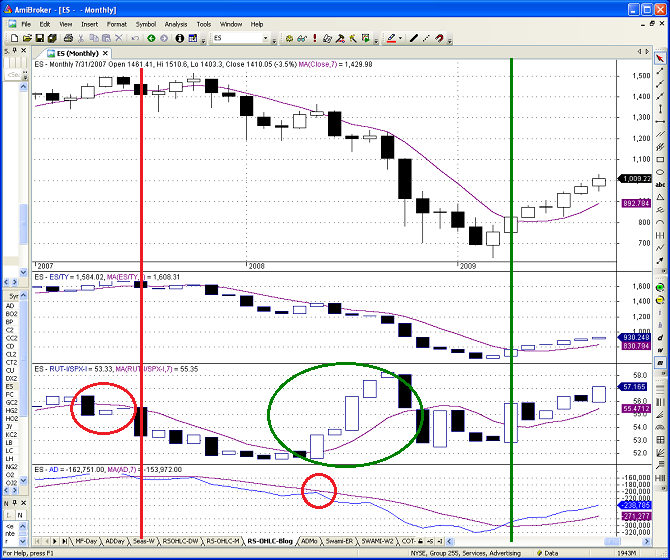
To gain more experience with these ratios, let's look at how they behaved during the 2008 market meltdown. Figure 1 below is a monthly chart of the E-mini S&P 500 continuous futures (ES) contract from 2007 to mid-2009. Note that I used a monthly chart for this example. When looking at long-term cyclical trends, it helps to use longer-term chart periods - to eliminate the noise in weekly or daily data.
The top panel of the chart is a monthly candlestick chart for the ES contract. Each panel of the chart includes a 7-month simple moving average (in purple). The second panel of the chart is the stock/bond relative strength ratio, also expressed as a candlestick chart. I used the ratio of the E-mini S&P 500 continuous futures contract (ES) divided by the price of the US Treasury Note continuous futures contract (TY). The resulting ratio was multiplied by 100, to increase the scale.
The third panel of the chart is the small-cap/large-cap relative strength ratio, also expressed as a candlestick chart. I used the Russell 2000 (RUT) index price divided by the S&P 500 (SPX) index price. The resulting ratio was multiplied by 100, to increase the scale.
Finally, the last panel is the cumulative advance decline line for the combined NYSE, AMEX, and NASDAQ exchanges. Relative strength ratios are useful tools, but should not be used in isolation. The advance decline line is a very effective market breadth indicator, which we will use in conjunction with the relative strength ratios to identify major cyclical trend changes in the ES contract. If you would like to read more about market breadth indicators, please revisit my recent article "The Secret Weapon of Technical Analysis."
The most conservative cyclical trend confirmation approach is to wait for the monthly closing price of the ES contract and all three indicators to be either above or below their respective 7-month moving averages. When all of these indicators line up in the same direction, this is a very powerful signal to either enter or exit the market.
The exit signal is noted by the red vertical line in Figure 1 above on July 31, 2007. The exit was signaled when the monthly price of the ES contract and all three indicators closed below their respective 7-month moving averages simultaneously. On the exit date, the closing price of the E-mini S&P 500 continuous futures contract was 1,455.27. The market made one more push to the upside over the next few months, but this would have been a pretty spectacular exit. Note that the RUT/SPX ratio crossed below its 7-month moving average three months earlier (red circle in their panel above), but this was not confirmed by the other indicators.
The signal to re-enter the market is noted by the green vertical line in Figure 1 above on 4/30/2009. This was the first date that the monthly price of the ES contract and all three indicators closed above their respective 7-month moving averages simultaneously. On the entry date, the closing price of the E-mini S&P 500 continuous futures contract was 872.81.
So what happened in mid-2008? Why did the small-cap/large-cap ratio increase so sharply for several months (green circle in the third panel above)? Remember when I explained that investors move their money from small-cap stocks to large-cap stocks in "typical" recessions? 2008 was not a typical recession. In response to the financial crisis, the prices of large-cap banks and financial companies plummeted - much more severely than most small-cap companies. As a result, the small-cap/large-cap ratio actually increased in mid-2008.
This illustrates the importance of using multiple trend confirmation indicators. It also means that we must always evaluate the reasons for unusual behavior in relative strength ratios. Fortunately, the advance decline line remained below its 7-month moving average, preventing a premature buy signal.
What are the Relative Strength Indicators Telling us Now - in 2012?
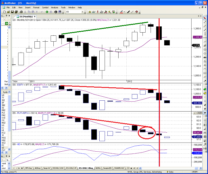
Figure 2 below is a monthly chart of the E-mini S&P 500 continuous futures (ES) contract from November 2010 through June 1, 2012 (last Friday). The panels in Figure 2 below are the same as in Figure 1. The most recent exit signal occurred on May 31, 2012 and is noted by the red vertical line below. The exit was signaled when the monthly price of the ES contract and all three indicators closed below their respective 7-month moving averages simultaneously. On the exit date, the closing price of the E-mini S&P 500 continuous futures contract was 1,310.33.
Will the exit signal prove to be prophetic? Are we entering another 2008 scenario or will the market rebound to new highs? Only time will tell, but the exit signal below is unambiguous. The price behavior of the ES contract, the two relative strength indicators, and the cumulative advance decline line all suggest we are now in a down trend. Based on this trend confirmation method, the next buy signal would not occur until all of the above indicators cross above their respective 7-month moving averages.
There is another very important bearish pattern in Figure 2. Note the horizontal lines in the top three panels of the chart above. The lines connect the most recent highs for the ES contract and for the two relative strength price ratios.
As you can see above, the green line in the top panel is upward-sloping; the ES contract recently made a higher high. The slopes of the red lines in the next two panels are both downward-sloping; the relative strength ratios both recently made lower highs. This is called a divergence and it is a very significant bearish pattern. This divergence was evident even before the prices declined below their respective 7-month moving averages. The divergence pattern provided an advance warning of the recent price decline in the E-mini S&P futures contract.
This illustrates the flexibility of relative strength ratios. Once we calculate a relative strength ratio, we can use any or all of our technical analysis tools or indicators on that price series: RSI, stochastics, MACD, moving averages, trend lines, divergences, Bollinger bands, etc. The relative strength ratio can be treated just like any other symbol; there is no limit to the number or type of calculations that we can do with relative strength price ratios.
Other Relative Strength Ratios
The stock/bond and small-cap/large-cap ratios are just two examples of relative strength ratios that can be used to confirm cyclical trend changes. The key is to use the price of the riskier asset in the numerator and the price of the safer asset in the denominator. Here are a few more examples:
- Consumer discretionary / Consumer Staples - (XLY/XLP)
- Finance / S&P 500 - (XLF/SPY)
- Goldman Sachs Commodity Index / US Treasury Bond Prices - (GSCI/US)
- Technology / Large-Cap Stocks - (QQQ/SPY)
- Copper / Gold
- Transportation / Industrials - (IYT/XLI)
- Australian Dollar / US Dollar
- Stocks / US Treasury Bonds or Notes - (ES/US) or (ES/TY)
- Small-Cap stocks / Large-Cap Stocks - (RUT/SPX) or (IWM/SPY)
None of the ratios is perfect, but all of the relative strength ratios will help you gain some additional insight into the flow of funds between riskier and safer assets, which will help you identify trend changes.
Daily Risk Snapshot
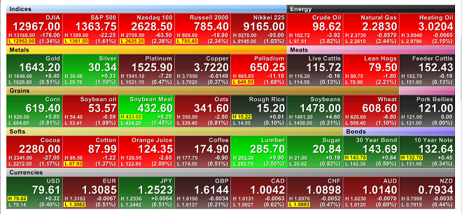
Even without looking at the long-term trend in relative strength ratios, we can use our understanding of risky assets to evaluate the performance of the market every day. Figure 3 below is a color heat-map of the performance of a wide range of futures contracts on May 4th, 2012 . The image is a screen shot from FINVIZ.com, which stands for Financial Visualizations. FINVIZ is also one of our affiliates and you will find a separate link to FINVIZ products in the sidebar to the right.
The FINVIZ daily heat-map provides a comprehensive overview of the primary futures markets. Note how the individual futures contracts are grouped by sector; each sector has a color-coded title bar. The top row of the heat-map includes equity and energy contracts. The next row includes metals and meats. Grains are in the third row, followed by softs and bonds in the next. Finally, currencies take up the entire bottom row.
Rather than limit our analysis of the market to the return on the equity indices, let's look at the pattern of returns across all markets to gain a broader understanding of the flow of funds between riskier and safer assets.
The equity indices in the top row were sharply lower, indicating a shift from risky to safer assets - at least for the day. On the same row, look at the energy contracts. They were all significantly lower as well. Crude Oil and Heating Oil are both "risky" assets and tend to move with the economy. The decline in the energy prices was consistent with the drop in equity prices, adding more weight to the shift out of risky assets.
Gold and silver can both act as safe havens during times of uncertainty, but that is not always the case. The remaining metals contracts tend to move in sync with the economy. In the second row above, you can see that gold and silver prices both increased during the day, while the other metals contracts declined. Again, this provides additional support for our earlier conclusions.
If investors were moving to safer assets, then US Treasuries should have done well. In the next to last row, you can see that prices of the Treasury Note and Treasury Bond contracts both increased. Historically, the US Dollar and the Japanese Yen futures contracts have acted as safe havens, while the remaining currency futures contracts have acted as "risky" assets. The US Dollar and the Japanese Yen contracts both performed well, while all other currency futures contracts declined in price.
There is a lot of volatility in the agricultural contracts, so the pattern is not always so obvious. However, dramatic increases in risk aversion often leads to lower agricultural commodity prices - as deflation risk intensifies. On average, agricultural commodity prices were lower on May 4th, 2012, but there were a few notable exceptions.
In addition to reviewing the performance of all of the futures contracts, we could also gain some additional insight from examining the daily changes in the other relative strength ratios above.
Looking at a broad range of assets gives us a much better understanding of flow of funds driving market movements, even for daily or intra-day periods. The more consistent the return performance across all market segments, the more meaningful the shift between risky and non-risky assets.
Conclusion
As we saw in the 2008 example in Figure 1, relative strength ratios are important tools for trend confirmation, but they should not be used in isolation. External factors can temporarily influence one or more of the ratios. Ideally you should also use additional indicators for trend confirmation. Consider using point and figure charts, moving averages, market-breadth statistics, and COT data.
As explained in last week's article, the E-mini S&P futures contract recently broke its intermediate-term bullish trendline. As illustrated above, the monthly close for the ES contract on May 31, 2012 was also below its 7-month simple moving average. To make matters worse, both of the relative strength ratios above also closed below their respective 7-month moving averages on May 31, as did the advance decline line. The current picture of the S&P 500 looks quite bleak.
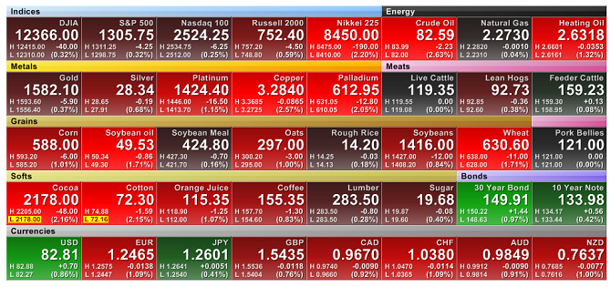
Here is the latest futures snapshot from FINVIZ (at 8:15 am EDT) on June 8, 2012. Notice that the ES contract is only down 0.32% overnight, but the overall risk picture looks much worse. The only major futures contracts with significant overnight gains are US Treasury Bonds and Notes, the US Dollar, and the Japanese Yen. It is possible to get a very good read on risk preferences - even before the US equity markets open.
As is always the case, all articles on Trader Edge are presented for educational purposes only; they are not trade recommendations or investment advice. There are many other factors that will influence your investment decisions and those factors cannot be conveyed in educational articles.
One final ancillary note: the relative strength ratios presented in this article can be used as an analytical tool for pair trading (taking a simultaneous long position in one security and a short position in a second security). Pair trading is beyond the scope of this article, but I would be remiss if I did not mention this very effective extension of relative strength price ratios
Feedback
Your comments, feedback, and questions are always welcome and appreciated. Please use the comment section at the bottom of this page or send me an email.
Do you have any questions about the material? What topics would you like to see in the future?
Referrals
If you found the information on www.TraderEdge.Net helpful, please pass along the link to your friends and colleagues or share the link with your social network.
The "Share / Save" button below contains links to all major social networks. If you do not see your social network listed, use the down-arrow to access the entire list of social networking sites.
Thank you for your support.
Brian Johnson
Copyright 2012 - Trading Insights, LLC - All Rights Reserved.
.







Pingback: Live Dow Futures | NYSE, New York Stock Exchange
Pingback: Market Timing with Relative Strength Revisited | Trader Edge
Pingback: Take the First Step Toward an Investment Process | Trader Edge