Market breadth is one of the most reliable leading indicators of market reversals and major market turning points; breadth looks particularly ugly right now. There are many different ways to look at market breadth; we will review several in this post and I will provide links to external articles.
Percent Above 200 MA
One of the best known trend measures is the 200-day moving average. When the price of a stock is above its 200-day moving average, the long-term trend is positive. When the price of a stock is below its 200-day moving average, the trend is negative. Simple.
It stands to reason that the majority of stocks should be above their respective 200-day moving averages in a bull market. And that is definitely true for a health bull market. But it is not true right now; even with equity indices near their all-time highs.
In his recent article, Victor Reklaitis reports on the market breadth of the NYSE:
A graphic from Josh Brown over at The Reformed Broker illustrates this fear quite well. He calls it his “chart of the year,” and it’s reproduced below. “If you own the S&P 500, you were bailed out by a handful of giant companies that masked the pain beneath the surface,” Brown writes.
“At present, just 28% of all NYSE names are in uptrends, or less than 1 in 3 stocks. That’s not a bull market,” he adds.
The stock market’s narrowing leadership is “not great for sentiment,” Brown writes. “What usually follows next is the growing hordes of laggard stocks continues to grow as, one by one, the leaders succumb and fall,” he adds cheerily.
Relative Performance of Top Market-Cap Stocks
Another interesting approach to market breadth is to analyze the returns of the largest stocks relative to the returns of the remaining stocks in an equity index.
Shawn Langlois provided the following quote by Christine Hughes (chief investment strategist for OtterWood Capital) in his recent article:
"There’s a troubling gap between the top 10 stocks by market cap and the rest of the U.S. market. In fact, the “mega stocks” are up about 14% this year. Take those out of the S&P SPX, -0.94% and the index is down 6%. The spread amounts to 20%, as this chart shows. The last time it was this wide was in 1999, and we all know how ugly it got from there"
In other words, the largest (and presumably safest) stocks are keeping the market afloat and artificially inflating the index returns, making the equity indices appear much stronger than they really are.
Cumulative Advance-Decline Line
One of the easiest ways to evaluate market breadth is to calculate the cumulative total of the advances and declines and compare that value to a moving average of the same series.
The blue line in the bottom panel below represents the monthly cumulative advance-decline data for the combined AMEX, NYSE, and NASDAQ. The green and red lines in the lower panel represent long-term moving averages of the advance-decline line. When the blue line falls below the lowest moving average line, there is an increased risk of a market correction. The monthly candlestick chart for the S&P 500 index is included in the top panel for reference purposes.
The red box from late 2007 to early 2009 marks the period when the cumulative advance decline line was below the lowest moving average line. This period coincides almost exactly with the peak and trough of the SPX during the Great Recession.
There were two false alarms (depicted with red circles): one in 2011 and a second in 2012. Fortunately, they were very brief. The red rectangle on the far right-side of the chart is more interesting. The monthly cumulative advance decline line dropped below its long-term moving average five months ago and has remained there.
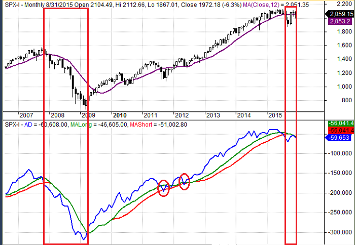
Cumulative Advance-Decline 12-31-2015
Conclusion
Market breadth is a very powerful tool. Three different measures of market breadth are all telling the same story: the bull market is in jeopardy.
Print and Kindle Versions of Brian Johnson's 2nd Book are Available on Amazon (75% 5-Star Reviews)
Exploiting Earnings Volatility: An Innovative New Approach to Evaluating, Optimizing, and Trading Option Strategies to Profit from Earnings Announcements.
Print and Kindle Versions of Brian Johnson's 1st Book are Available on Amazon (79% 5-Star Reviews)
Option Strategy Risk / Return Ratios: A Revolutionary New Approach to Optimizing, Adjusting, and Trading Any Option Income Strategy
Trader Edge Strategy E-Subscription Now Available: 20% ROR
The Trader Edge Asset Allocation Rotational (AAR) Strategy is a conservative, long-only, asset allocation strategy that rotates monthly among five large asset classes. The AAR strategy has generated annual returns of approximately 20% over the combined back and forward test period. Please use the above link to learn more about the AAR strategy.
Brian Johnson
Copyright 2015 - Trading Insights, LLC - All Rights Reserved.
About Brian Johnson
I have been an investment professional for over 30 years. I worked as a fixed income portfolio manager, personally managing over $13 billion in assets for institutional clients. I was also the President of a financial consulting and software development firm, developing artificial intelligence based forecasting and risk management systems for institutional investment managers.
I am now a full-time proprietary trader in options, futures, stocks, and ETFs using both algorithmic and discretionary trading strategies.
In addition to my professional investment experience, I designed and taught courses in financial derivatives for both MBA and undergraduate business programs on a part-time basis for a number of years. I have also written four books on options and derivative strategies.


Bearish Market Breadth
Market breadth is one of the most reliable leading indicators of market reversals and major market turning points; breadth looks particularly ugly right now. There are many different ways to look at market breadth; we will review several in this post and I will provide links to external articles.
Percent Above 200 MA
One of the best known trend measures is the 200-day moving average. When the price of a stock is above its 200-day moving average, the long-term trend is positive. When the price of a stock is below its 200-day moving average, the trend is negative. Simple.
It stands to reason that the majority of stocks should be above their respective 200-day moving averages in a bull market. And that is definitely true for a health bull market. But it is not true right now; even with equity indices near their all-time highs.
In his recent article, Victor Reklaitis reports on the market breadth of the NYSE:
Relative Performance of Top Market-Cap Stocks
Another interesting approach to market breadth is to analyze the returns of the largest stocks relative to the returns of the remaining stocks in an equity index.
Shawn Langlois provided the following quote by Christine Hughes (chief investment strategist for OtterWood Capital) in his recent article:
In other words, the largest (and presumably safest) stocks are keeping the market afloat and artificially inflating the index returns, making the equity indices appear much stronger than they really are.
Cumulative Advance-Decline Line
One of the easiest ways to evaluate market breadth is to calculate the cumulative total of the advances and declines and compare that value to a moving average of the same series.
The blue line in the bottom panel below represents the monthly cumulative advance-decline data for the combined AMEX, NYSE, and NASDAQ. The green and red lines in the lower panel represent long-term moving averages of the advance-decline line. When the blue line falls below the lowest moving average line, there is an increased risk of a market correction. The monthly candlestick chart for the S&P 500 index is included in the top panel for reference purposes.
The red box from late 2007 to early 2009 marks the period when the cumulative advance decline line was below the lowest moving average line. This period coincides almost exactly with the peak and trough of the SPX during the Great Recession.
There were two false alarms (depicted with red circles): one in 2011 and a second in 2012. Fortunately, they were very brief. The red rectangle on the far right-side of the chart is more interesting. The monthly cumulative advance decline line dropped below its long-term moving average five months ago and has remained there.
Cumulative Advance-Decline 12-31-2015
Conclusion
Market breadth is a very powerful tool. Three different measures of market breadth are all telling the same story: the bull market is in jeopardy.
Print and Kindle Versions of Brian Johnson's 2nd Book are Available on Amazon (75% 5-Star Reviews)
Exploiting Earnings Volatility: An Innovative New Approach to Evaluating, Optimizing, and Trading Option Strategies to Profit from Earnings Announcements.
Print and Kindle Versions of Brian Johnson's 1st Book are Available on Amazon (79% 5-Star Reviews)
Option Strategy Risk / Return Ratios: A Revolutionary New Approach to Optimizing, Adjusting, and Trading Any Option Income Strategy
Trader Edge Strategy E-Subscription Now Available: 20% ROR
The Trader Edge Asset Allocation Rotational (AAR) Strategy is a conservative, long-only, asset allocation strategy that rotates monthly among five large asset classes. The AAR strategy has generated annual returns of approximately 20% over the combined back and forward test period. Please use the above link to learn more about the AAR strategy.
Brian Johnson
Copyright 2015 - Trading Insights, LLC - All Rights Reserved.
About Brian Johnson
I have been an investment professional for over 30 years. I worked as a fixed income portfolio manager, personally managing over $13 billion in assets for institutional clients. I was also the President of a financial consulting and software development firm, developing artificial intelligence based forecasting and risk management systems for institutional investment managers. I am now a full-time proprietary trader in options, futures, stocks, and ETFs using both algorithmic and discretionary trading strategies. In addition to my professional investment experience, I designed and taught courses in financial derivatives for both MBA and undergraduate business programs on a part-time basis for a number of years. I have also written four books on options and derivative strategies.