
I included a brief coronavirus update in my most recent recession model post, but it has since become clear that the speed, breadth, and longevity of the coronavirus will be the principal determinants of all near-term and long-term asset prices: equities, credit instruments, commodities, real estate, etc. As a result, I decided to develop an epidemiological model to simulate future coronavirus scenarios, under a wide range of assumptions. The intermediate goal of developing the model is to understand the likely speed, breadth, and longevity of the virus under different scenarios and be able to quantify the future effects of policy intervention and treatment initiatives. The ultimate goal is to use these new insights to evaluate the probable future impact on the economy and asset prices.
The Model
I am not an expert on epidemiology, but I have done extensive modeling work. That said, it was far easier to tweak an existing model, rather than starting from scratch. A simple web search yielded a very promising starting point. The article was titled “Social Distancing to Slow the Coronavirus” by Christian Hubbs. I chose this article/model as a starting point because the author included Python code, which expedited the modeling process and allowed me to cross check my results.
Hubbs used a SEIR model, which is an acronym for Susceptible, Exposed, Infected, Recovered, which breaks a fixed population down into the above four categories (which sum to 100%). The susceptible group has not yet been exposed to the virus and has no immunity. Exposed and Infected are self-explanatory, but the Recovered group actually includes people who have recovered from the virus (and have immunity), plus the people who have died from the virus. A more appropriate name for this group would probably be “Resolved.” Fortunately, given the relatively low mortality rate for the COVID-19 (1-2%), it is not necessary to separate deaths from the recovered group for modeling purposes.
I will not repeat the Hubbs formulas here, but they use a series of input parameters that are specific to the Coronavirus to describe how the population transitions from one group to the next: Susceptible to Exposed, to Infected, to Recovered. Hubbs also explains how each of these input values are used to calculate the values of intermediate variables that are used directly in the formulas. Please review the Hubbs article if you would like more detail on the exact formulation. I will include the input and intermediate values in the scenario tables below, but I will not provide the formulas here.
As implied by the title of his article, Hubbs cleverly added a social distancing parameter to his model, which reduces social interactions and slows the spread of the virus. This is essential for modeling the effects of social distancing policies and restrictions across the globe.
Model Improvements
I made two significant improvements to the Hubbs SEIR model. First, Hubbs applied the social distancing adjustment in perpetuity, which is not practical or realistic. I added an end date variable for the social distancing adjustment, which allowed me to simulate social distancing restrictions of different durations. My social distancing parameter ranges from 0% (standard SEIR model with no social distancing) to 100% (no social interaction). I found this formulation more intuitive, but it is the reverse of the social distancing formulation in the Hubbs article. The effects are the same. However, adding the end date makes a dramatic difference.
Second, I added an immunity period variable, which allows the recovered group to become re-infected probabilistically after a specified period. Preliminary research reports indicate that some patients who have recovered from the Coronavirus have already become re-infected, even though the first official reports of the virus date back only two months. This immunity period variable is particularly important in modeling future outbreaks of the virus as the population eventually transitions from Recovered back to Susceptible. These simulations are critical in determining the maximum time period for the development and distribution of a COVID-19 vaccine globally.
Input Assumptions
There are a number of characteristics that are specific to the Coronavirus, all of which affect how quickly the population transitions from Susceptible to Exposed, to Infected, to Recovered. These values also affect the eventual peak in each of these groups, which is critical to determining whether global health resources would be overrun. The spreadsheet is particularly valuable for simulating alternative virus assumptions, but here are the values I assumed for the initial simulations (see Table 1 below):
Incubation Period: 5 Days
Infectious Period: 10 Days
Hospitalization Rate: 10% of infected population
R0 (pronounced “R Naught:” 3.5 (slightly less than SARS (4.0))
R0 quantifies the contagiousness of an infectious disease. It represents the number of people (without immunity) who will become infected by a single contagious person. The initial SEIR population conditions (S:99.9859%, E:0.0038%, I:0.0076%, R:0.0027%) were estimated from the global Coronavirus population values on March 31, 2020. Finally, I begin by assuming all people in the Recovered group have perpetual immunity and no social distancing.
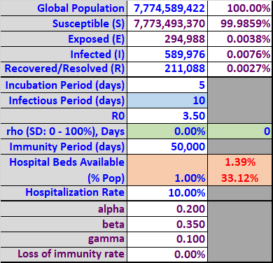
Table 1
The results of the above simulation are shown in Graph 1 below. The horizontal or X-axis represents the number of days into the future, with zero representing March 31, 2020. The left-hand (vertical) Y-axis represents the percentage of the global population for each of the SEIR groups, as well as the hospital beds available (bright red) and required (blue). In reality, the hospital bed variables (required and available) to treat Coronavirus patients are proxies for all of the necessary resources in the health care system: gloves, gowns, masks, hospital beds, medication, test kits, ventilators, lab technicians, nurses, doctors, etc. If the required resources exceed the available resources at any point, people would die in very large numbers. The primary goals in social distancing policy is to ensure these limited health-care resources are not exceeded, and to buy time to develop and distribute a vaccine.
Orange is used to show the percentage of the global population in the Exposed group (left-hand vertical axis) and dark red is used to show the percentage of the population in the infected group (left-hand vertical axis). Finally, the green line (right-hand vertical Y-axis) represents the percentage of the population in the susceptible group (with no immunity). The susceptible value is extremely important in determining whether the virus has been controlled.
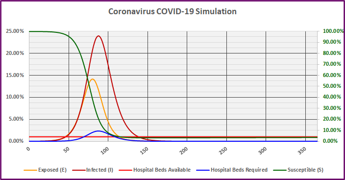
Graph 1
The first simulation in Graph 1 above does not include any social distancing; the effects are extreme. The infected group (dark red) peaks on day 87 with almost 24% of the population infected simultaneously. The resulting peak requirement of hospital beds equals 2.39% (blue line) of the population, which exceeds the assumed available beds (bright red line) of 1% by 1.39% (Table 1). The cumulative bed shortage (sum of bed shortage over all scenario days) equals 33.12% (Table 1). This would result in catastrophic loss of life.
The percentage of the population Exposed begins to decline on day 81 and the Susceptible percentage drops below 35% on day 82. This is not a coincidence. The population remains at risk until the percentage of the population Susceptible (without immunity) drops below approximately 35%. There are only two ways this could happen: the population develops immunity in response to infection, or from a successful vaccine.
The percentage of the population Infected begins to decline on day 88, shortly after the peak in Exposures. However, the infected population does not drop below 1% until day 139. To put that in perspective, 1% of the population being infected would still represent over 100 times the current Infected group (0.0076%). Even without direct governmental restrictions on social interaction, healthy individuals would shelter at home out of self-preservation and sick individuals would be forced into quarantine or hospitalization as appropriate. Disruptions to commerce would persist for five brutal months and loss of life would be severe.
Scenario II – 50% Social Distancing for 30 Days
The Federal Government has proposed an extension of shelter at home until April 30, 2018, 30 days into the future. Scenario II uses the same assumptions as Scenario I above, but adds 50% social distancing (reducing social interaction by 50%) for a period of 30 days (Table 2 below).

Table 2
The simulation in Graph 2 below includes 50% social distancing for 30 days. It may surprise you, but the effects are still extreme. In fact, the results are almost identical to Scenario I, they are just delayed. The infected group (dark red) now peaks on day 107 with almost 24% of the population infected simultaneously. The resulting peak requirement of hospital beds still equals 2.39% (blue line) of the population, which again exceeds the assumed available beds (bright red line) of 1% by 1.39% (Table 2). The cumulative bed shortage (sum of bed shortage over all scenario days) equals 33.09% (Table 2). This would still result in catastrophic loss of life.
Short-term social distancing does allow some additional time to increase resources, but does not reduce the Susceptible population significantly. Even after 30 days, the virus would still be lingering in the population and would quickly infect the unprotected Susceptible population after social distancing rules were relaxed. Remember, the global pandemic originated with a single patient zero in China.
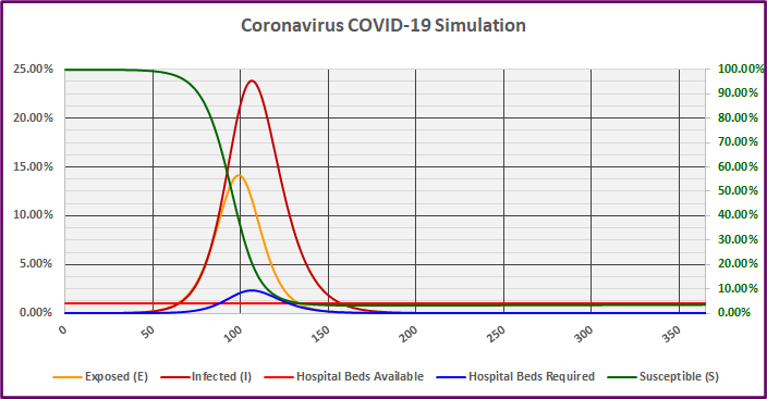
Graph 2
In Scenario II, the percentage of the population Exposed begins to decline on day 100 and the Susceptible percentage drops below 35% on day 100 as well.
The percentage of the population Infected begins to decline on day 107, shortly after the peak in Exposures. However, the infected population does not drop below 1% until day 158. Even with 30 days of direct governmental restrictions on social interaction, for the next 128 days, healthy individuals would choose to shelter at home out of self-preservation and sick individuals would be forced into quarantine or hospitalization. Disruptions to commerce would persist for over five months, and the loss of life would be no less severe (barring a vaccine breakthrough or weather-related slowing of virus transmission).
Scenario III – 50% Social Distancing for 120 Days
Since 30 days was not sufficient to limit the spread of the virus and loss of life, I tried 120 days. Scenario III uses the same assumptions as Scenario II above, but extends 50% social distancing (reducing social interaction by 50%) for a period of 120 days (Table 3 below).
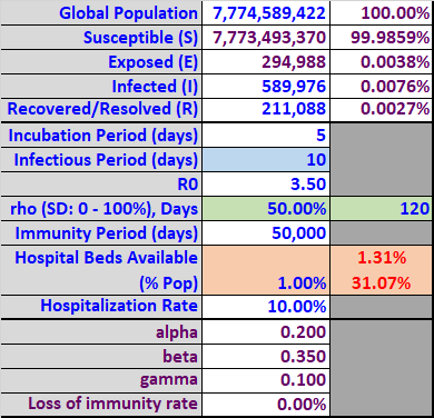
Table 3
The simulation in Graph 3 below includes 50% social distancing for 120 days. The results are still almost identical to Scenario II, the peaks are just delayed. The infected group (dark red) now peaks on day 163 with just over 23% of the population infected simultaneously. The resulting peak requirement of hospital beds equals 2.31% (blue line) of the population, which again exceeds the assumed available beds (bright red line) of 1% by 1.31% (Table 3). The cumulative bed shortage (sum of bed shortage over all scenario days) equals 31.07% (Table 3). This would still result in catastrophic loss of life.
Short-term social distancing does allow some additional time to increase resources, but does not reduce the Susceptible population significantly. Even after 120 days, the virus would still be lingering in the population and would quickly infect the unprotected Susceptible population.
Graph 3
In Scenario III, the percentage of the population Exposed begins to decline on day 157 and the Susceptible percentage drops below 35% on day 157 as well.
The percentage of the population Infected begins to decline on day 164, shortly after the peak in Exposures. However, the infected population would not drop below 1% until day 215. Even with 120 days of direct governmental restrictions on social interaction, for the following 95 days, healthy individuals would choose to shelter at home out of self-preservation and sick individuals would be forced into quarantine or hospitalization. Disruptions to commerce would persist for over seven months, and the loss of life would be no less severe.
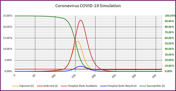
Scenario IV – 50% Social Distancing for 215 Days
Since 120 days was still not sufficient, I extended the social distancing period to 215 days. Scenario IV uses the same assumptions as Scenario I-III above, but extends 50% social distancing (reducing social interaction by 50%) for a period of 215 days (Table 4 below).

Table 4
The simulation in Graph 4 below includes 50% social distancing for 215 days. This time the results are different. The infected group (dark red) is bimodal with the second (higher) peak occurring on day 236 with only 8.2%% of the population infected simultaneously. The resulting peak requirement of hospital beds equals 0.82% (blue line) of the population, which remains under the assumed available beds (bright red line) of 1% by 0.18% (Table 4). The cumulative bed shortage (sum of bed shortage over all scenario days) equals 0.0% (Table 4). This is the first scenario where all patients would have full access to all health care resources, minimizing the loss of life.
Graph 4
In Scenario IV, the percentage of the population Exposed initially begins to decline on day 189, but spikes after the social distancing rules are relaxed on day 215. The Exposed percentage begins to decline again (the second time) on day 228 and the Susceptible percentage drops below 35% on day 225.
The percentage of the population Infected initially begins to decline on day 198, but also spikes after the social distancing rules are relaxed on day 215. The Infected percentage begins to decline again (the second time) on day 237, shortly after the second peak in Exposures. However, the infected population would not drop below 1% until day 295.
Finally, with 215 days of forced governmental restrictions on social interaction, the progression of the virus could be slowed long enough to provide care for all Coronavirus patients. However, disruptions to commerce would persist for almost 10 months.
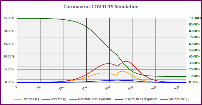
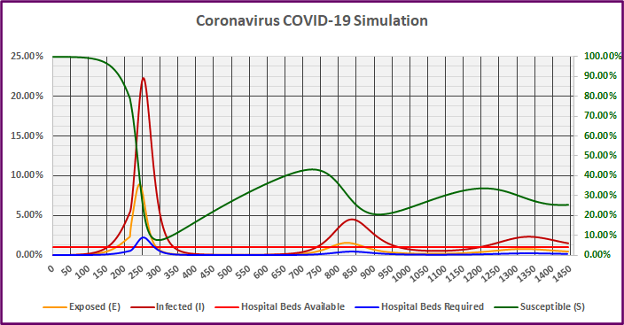
Scenario V – 50% Social Distancing for 215 Days, Plus loss of immunity
Scenario V uses the same assumptions as Scenario IV above, but gradually reduces immunity for the Recovered group. As I explained earlier, there is already evidence of reinfection after a few short months.

Table 5
The simulation in Graph 5 below includes 50% social distancing for 215 days, plus a probabilistic loss of immunity over an average period of two years (730 days). The horizontal axis in Graph 5 now extends out four years (1460 days). The left and right vertical axes are unchanged.
Graph 5
During the initial wave of the virus, the values and progression of the Susceptible, Exposed, and Infected groups are very similar to Simulation IV. However, we now see additional waves of infection occur in subsequent years as the population gradually loses its immunity and the Susceptible percentage grows above the minimum threshold required for the virus to propagate. Based on these assumptions, if a successful vaccine was developed and distributed in the next 500 days or so (directly reducing the Susceptible population and increasing the Recovered or immune population), that should be sufficient to prevent subsequent waves of infection.
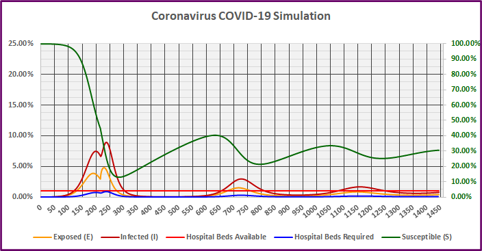
Scenario VI – Longer Infectious Period (15 days)
It is important to realize that very little is known about COVID-19. As a result, different scenarios should be evaluated based on alternative input assumptions. Scenario VI uses the same assumptions as Scenario V above, except for increasing the infectious period from 10 to 15 days.
Table 6
The simulation in Graph 6 below includes 50% social distancing for 215 days, plus gradual loss of immunity, with a longer infectious period (15 days). Even with 50% social distancing, the longer infectious period would be catastrophic.
Graph 6
The infected group (dark red) now peaks on day 253 with just over 22% of the population infected simultaneously. The resulting peak requirement of hospital beds equals 2.23% (blue line) of the population, which again exceeds the assumed available beds (bright red line) of 1% by 1.23% (Table 6). The cumulative bed shortage (sum of bed shortage over all scenario days) equals 41.54% (Table 6). This would result in catastrophic loss of life. If a vaccine was not developed, we would again see subsequent waves of infection, but they would be less severe. While the sensitivity to a longer infectious period is startling, it might offer a clue to managing the war against the virus.
Scenario VII – Shorter Infectious Period (15 days)
While we cannot change the nature of the Coronavirus, it might be possible to take external actions to artificially reduce the infectious period. Scenario VII uses the same assumptions as Scenario VI above, except for decreasing the infectious period to only 5 days.

Table 7
The simulation in Graph 7 below includes 50% social distancing for 215 days, plus gradual loss of immunity, with a shorter infectious period (5 days). With 50% social distancing for 215 days and a shorter infectious period, the virus is much more manageable. In fact, it would probably be possible to significantly shorten the social distancing period.
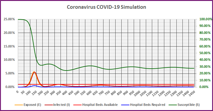
Graph 7
The infected group (dark red) now peaks on day 134 with only 5.62% of the population infected simultaneously. The resulting peak requirement of hospital beds equals 0.6% (blue line) of the population, which is well below the assumed available beds (bright red line) of 1%. As a result, the cumulative bed shortage (sum of bed shortage over all scenario days) equals 0.0% (Table 7).
If a vaccine was not developed in time, we would again see subsequent waves of infection, but they would be far less severe. This is clearly the best-case scenario I have presented, but what steps could be taken to artificially shorten the infectious period from 10 days to five days?
Initially, widespread social distancing (shelter at home requirements) would be necessary to reduce growth rate and the number of infected cases. Once this was accomplished, it could be possible to shorten the infectious period by using widespread (universal) and repeated testing, followed by selective quarantine of infected individuals, and all people who have come in close contact with them. In other words, if the virus could be discovered much faster, the infectious period could be artificially reduced by immediately placing all affected people in quarantine. This is very similar to the initial approach successfully implemented in South Korea. It would require a massive and efficient testing effort, but it would cost far less than two trillion dollars.
If this approach was effective, it could also eliminate the requirement for widespread shelter at home requirements, allowing individuals to return to work and school. This would minimize the impact on the economy, corporate profits, and job losses.
Unfortunately, the initial reaction of many communities has been to restrict testing to the most at-risk segments of the population (over 65, those with pre-existing health conditions, those requiring hospitalization, etc.). This is the worst possible approach. It will lead to longer infectious periods as many Infected but asymptomatic people continue to interact with the Susceptible population, rapidly spreading the disease. In addition, failing to conduct adequate testing would eliminate the ability to even estimate the percentage of the population in the SEIR groups, which would make it even more challenging to manage the disease through policy and health care initiatives.
Realistic Modeling
Simulation results are only as good as the inputs used and the accuracy of the underlying models. The SEIR model with social distancing is a reasonable representation of virus transmission. However, there is room for improvement. For example, there are really multiple populations, each with different social distancing requirements, demographics, and SEIR population percentages.
If I worked for the CDC or the WHO, I would create separate SEIR models for each county, city, state, and region, each of which would have variable connections to every other entity. As travel limitations were implemented and removed, this would restrict or allow model interaction in real-time between various cities and states, etc. It would also be possible to change the social distancing restrictions in real-time or even model dynamic changes in response to the population percentages of the Infected or Susceptible groups.
For example, it is unreasonable to assume that social distancing in NYC will be as effective as in Alaska, Wyoming, or Montana. It is simply not practical for residents on the 20th floor of a high-rise in NYC to walk up and down 20 flights of stairs, and it is not possible to maintain social distancing in an elevator.
In practice, the social distancing model parameter will equal the greater of the federal, state, and local restrictions, and the aggregate personal protective measures adopted by individuals and families. These parameters will change on a daily basis in response to the evolving virus statistics in each location and could be modeled dynamically. The resulting group of SEIR models would be far more realistic, with specific social distancing values that evolve and are specific to each location.
However, for purposes of understanding the duration, breadth, and severity of the global pandemic (and the economic and financial consequences), the SEIR model with social distancing is sufficient.
Conclusion
Before I built my version of the SEIR model with variable social distancing, I was (and am still) calculating the growth rates of Coronavirus cases daily for every county and for the world. While this information is useful, it is backward-looking. To understand how the coronavirus will affect the economy and asset prices, it is essential to use a forward-looking approach that integrates judgement with simulation tools. It is obvious that the markets are currently responding to the daily virus statistics as they become available, but this is short-sighted and ill-advised.
As the SEIR simulation model shows, it is possible to contain the virus temporarily by severely limiting social interaction. However, the if the limits were not maintained for an extended period of time, the benefit would only be temporary and the virus would return with a vengeance (because the Susceptible percentage would still be very high).
Similarly, it is also possible that warmer weather could dramatically slow the spread of the virus. However, even if that is true, the growth rates would explode in the southern Hemisphere in the next few months. Unless we restricted all travel out of the southern Hemisphere in the fall, the virus would return to the northern Hemisphere again late this year (because the Susceptible percentage would still be very high).
The virus will not be completely contained until there is widespread distribution of a successful vaccine or a sufficient percentage of the population becomes immune through infection. In both of these scenarios, the percentage of the Susceptible population would be reduced below the required threshold.
I did not adequately understand the potential evolution of the Coronavirus until I built this model. The model is very basic and only requires six formulas, all of which are provided in the Hubbs article. If you would like to understand and experiment with plausible virus scenarios (and the effect on asset prices), I strongly encourage you to build a similar model in a spreadsheet for experimentation and analysis. Programming is not required and you do not need to use the Python code from the article. I have found this spreadsheet to be invaluable and highly instructive. It is particularly valuable to be able to objectively evaluate different assumptions and policy actions in real-time.
While I hope the model results turn out to be overly pessimistic, I have not been able to construct a more benign scenario using reasonable model assumptions. Instead, the scenarios paint a bleak picture, but offer a glimmer of hope by potentially using widespread and repeated testing to reduce the infectious period until a vaccine could be developed. Knowledge of the virus is growing rapidly and new developments are also unfolding, so there is always some hope.
Barring unforeseen developments, the most likely conclusion is that the severe economic effects resulting from containing the spread of the virus could continue for six months to a year, with possible subsequent waves in the future. This would result in devastating and extended global declines in GDP, widespread business failures, extensive job losses, and long-lasting changes to supply chains, public policies, trade policies, and deficits. This possibility does not appear to be reflected in current asset prices.
Brian Johnson
Copyright 2020 Trading Insights, LLC. All rights reserved.


Pingback: Recession Model Forecast: 06-01-2020 | Trader Edge
Pingback: Recession Model Forecast: 07-01-2020 | Trader Edge