The exponential growth in processing speed and computer memory over the last 30 years has spawned countless new technical indicators and a wide range of new analytical tools. Unfortunately, the ever increasing array of choices has complicated the situation for many traders - making it even more challenging to develop a logical, intuitive, investment process.
What if I told you that there is a simple, effective, and objective way to determine both short-term and long-term price trends? There is...
It is called the point and figure method and its origins date back to the late 1800s. This in-depth article will explain how point and figure charts are created and how to apply the point and figure method to generate short-term buy and sell signals and to identify long-term price trends.
Point & Figure Basics
The point and figure method was developed long before personal computers and hand calculators, so it is simple by design. You will not need to create these charts by hand; free point and figure charts are available on the Internet.
However, before using the point and figure method, you should understand how these charts are created (all charts in this article are courtesy of StockCharts.com). X's represent rising prices, driven by demand. O's represent falling prices, driven by supply. Here are the general rules for constructing point and figure charts:
Point & Figure Rules
- New X's are based on the daily high
- New O's are based on the daily low
- Always check for a new box to be plotted in the existing column first
- X's or O's may be plotted daily, but NOT both
- Each column must have at least 3 X's or 3 O's
- Columns alternate from X's to O's
- Month values are plotted on the first of the month
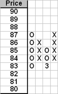
Example: It might be helpful to work through the following three-day example. Assume that we are in the first column of Figure 1 to the left, and the columns to the right do not yet exist.
Day 1: Low = 82.5, High = 85.0. Did the low fall into a new box? NO (82.5 is not < 82.0). Did the high move up by 3 boxes? NO (85 is not > 86.0, which is three boxes above the lowest box in the first column). No new elements (X's or O's) plotted on day 1.
Day 2: Low = 82.2, High = 86.5. Did the low fall into a new box? NO (82.2 is not < 82.0). Did the high move up by 3 boxes? YES (86.5 > 86.0, which is three boxes above the lowest box in the preceding column). X's plotted in boxes 84, 85, and 86.
Day 3: High = 86.5, Low = 82.75 Did the high enter a new box? NO (86.5 is not > 87.0). Did the low move down by 3 boxes? YES (82.75 < 83.0, which is three boxes below the highest box in the preceding column). O's plotted in boxes 85, 84, and 83.
Wait, why is there a "3" in the 83 box? Because this value happened to be plotted on March 1st. On the first day of the month, the month value is plotted on the chart (using 1-9 for Jan - Sep, and A-C for Oct - Dec).
It is important to always check for a new high (X's) or new low (O's) in the current column first. If you plot a new X or O in the current column, then you are done for the day. Never plot both X's and O's on the same day.
With a little practice, this process would become automatic. However, it is not our goal to create point and figure charts by hand. We simply need to have a basic understanding of the rules before using these charts in practice.
Short-Term Buy and Sell Signals
There are two main types of short-term trading strategies: breakout and reversal. A reversal strategy buys a security that is trending higher, but after a modest pullback in price. A breakout strategy buys a security after it breaks out above a prior resistance level. The standard point and figure method for generating short-term bullish and bearish signals is an example of a breakout strategy.
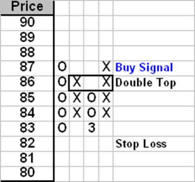
A short-term buy signal (see Figure 2 below) occurs when the current column of X's exceeds the high of the previous column of X's. In the case below, the previous column of X's reached box 86. When the current column of X's reached 86, this created a double top (two consecutive columns of X's with the same high value). When the current column of X's exceeded 86 and reached a new high of 87, that generated a buy signal.
Stop Value
Knowing when to enter a trade is important, but it is also critical to know when to cut your losses. Fortunately, the point and figure method provides a logical stop loss level: the price where the next short-term sell signal would be generated.
In this case, a new low of 82 would be one box below the lowest box of the preceding column of O's, which would generate a new sell signal. This objective measure of a reversal in the short-term trend would be an obvious signal to take our losses and exit the trade.
We also need to know when to exit the trade for a profit. Fortunately, the point and figure method can also be used to calculate an objective profit target.
Profit Target
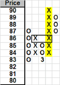
To determine the bullish profit target, first count the number of X's in the column that generated the buy signal. In this case, the number of boxes (shaded in yellow in Figure 3 to the left) is seven. Multiply that number by three and add the resulting boxes to the lowest price (84) in the buy signal column.
84 + (7 x 3) = 105
Note: you will not be able to calculate the profit target until prices reverse to a column of O's after the buy signal.
To calculate a profit target for a bearish trade, the process is similar: we multiply the number of boxes in the sell signal column by two instead of three. We then subtract those boxes from the highest price in the sell signal column.
If you would like some additional practice recognizing buy and sell signals, the following chart from Stockcharts.com illustrates a number of short-term buy (green) and sell (red) signals on the same chart.
Using the simple rules outlined above, the point and figure method can provide objective short-term buy and sell signals as well as prospective stop and profit target levels. In addition, the most recent buy or sell signal always identifies the direction of the short-term trend.
Long-Term Trends
The first rule of trading is to always trade in the same direction as the trend. Knowing the short-term trend is helpful, but knowing the long-term trend is essential. Not only will it increase your percentage of profitable trades, it will also help you preserve your capital in cyclical bear markets.
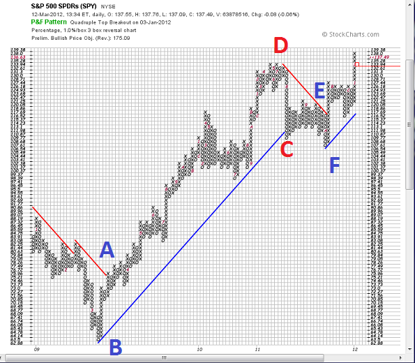
Figure 5 below is a point and figure chart of the SPY exchange traded fund (ETF). The numbers are small and difficult to read, but I would like you to focus on the big picture: the long-term trend lines.
The bearish trend/resistance lines (below) are depicted in red and are always drawn at a negative 45 degree angle (relative to a horizontal line or vector). Bullish trend/support lines are drawn in blue and are always drawn at a positive 45 degree angle (relative to a horizontal line or vector).
When a bearish resistance line is broken (by one full box), a new bullish support line is originated one box below the lowest column of O's in the chart pattern. This would initiate the beginning of a new long-term bullish trend. When a bullish support line is broken, a new bearish resistance line is originated one box above the highest column of X's in the chart pattern.
For an example of charting long-term point and figure trends on the SPY, please review the following sequence of events in Figure 5 above:
- A. Bearish resistance line is broken (3/2009), establishing a new uptrend
- B. Bullish support line is created (3/2009)
- C. Bullish support line is broken (8/2011), establishing a new downtrend
- D. Bearish resistance line is created (8/2011)
- E. Bearish resistance line is broken (10/2011), establishing a new uptrend
As you can see, the technique is not perfect, but it does a good job of identifying major long-term trends. It is easy to apply and completely objective. In fact, stockcharts.com will automatically plot these trend lines for you for any symbol in their database.
Box Sizes
If you examined the above charts carefully, you have already noticed one inconsistency that I did not address - box sizes. In my initial examples, I used a box size of $1.00. The Best Buy chart in Figure 4 used $0.50 boxes. The SPY chart in Figure 5 used variable box sizes. Which is correct?
Box sizes must be consistent with the "normal" level of volatility in the underlying security. Unfortunately, the magnitude of daily price changes is affected with the price of the underlying security. Higher priced securities experience larger daily dollar price changes, holding everything else constant.
To address this problem, early practitioners of the point and figure method used 1/4 point boxes at very low prices, then switched to 1/2 point boxes at slightly higher prices, then 1 point boxes, then 2 point boxes, and so on. Remember, they did not have computers or even calculators, so they needed a very simple procedure. Unfortunately, their solution resulted in a number of discrete box size intervals on the same point and figure chart.
I prefer a more modern, continuous solution to this problem. I use constant percentage size boxes. Box sizes are larger at higher prices and smaller at lower prices - continuously and automatically. The SPY chart in Figure 5 above was created using 1% boxes.
The SPY ETF attempts to replicate the return of the S&P 500 index, which is a diversified broad market, large cap index with relatively low volatility. For securities with greater volatility, you should consider a larger percentage, possibly 1.5% to 3%.
If you want a rule-of-thumb for determining a reasonable box size, look at the long term annualized historical or implied volatility (over many years) and divide that number by 16 to find an estimate of the daily volatility. Use the resulting daily percentage to create the point and figure chart for that security. For example, if the long-term annualized historical volatility were 32%, a reasonable box size might be 2% (32% / 16). I will discuss volatility in much more detail in future options related articles and posts.
Point & Figure Method in Practice
Now that you understand the rules behind the point and figure method, it is time to put it to work. I have already mentioned the importance of trading in the same direction as the prevailing trend. For investors with a long-term horizon, you could simply purchase the underlying security when a bearish resistance line is broken and sell, or even short, the same security when the long-term bullish support line is broken. You could set your own stop levels, or simply exit when the long-term trend reverses.
For investors with shorter term investment horizons, the point and figure method described above provides short-term buy and sell signals as well as prospective stop and profit target levels. Some investors prefer to wait for the first pull back (column of O's) after a buy signal to enter a bullish trade. This may allow you to buy at a lower price, but you may also miss trades if they break out and never look back.
If you would like to combine both the short-term and long-term trends into your investment process, you could use the short-term breakout process described above, but only trade in the direction of the long-term trend. For example, you would only take buy signals when you are above the long-term bullish support line and sell (short) signals when you are below the long-term bearish resistance line.
You would ignore short-term trades that went against the long-term trend. By definition, you would always be trading in the same direction as both the short-term and long-term trends. While this should lead to higher probability trades, always use stops to limit your losses.
The point and figure method is an objective, rule based approach. I am a strong proponent of using rule-based systematic trading strategies. Trading is very challenging and emotional reactions to both profits and losses can undermine our success. The field of behavioral finance has documented decision-making biases for many years. Using systematic strategies can help dampen our emotional responses to the market and eliminate some of our inherent biases.
The point and figure method is a straightforward approach that eliminates the noise embedded in a typical daily price chart. It provides a consistent, objective framework for evaluating both short-term and long-term trends.
If you would like to learn more about the point and figure method, you might be interested in the book: "Point & Figure Charting: The Essential Application for Forecasting and Tracking Market Prices, Fourth Edition" by Thomas J. Dorsey. The book goes into much more detail than was possible in this article. It covers chart patterns, relative strength investing, sector rotation, and broad market indicators - all based on the point and figure method. I have this book in my personal finance library and it is one of my Trader Edge book recommendations. Dorsey Wright and Associates also offers subscriptions to their point and figure analytical services
Trader Edge Strategy E-Subscription Now Available: 20% ROR
The Trader Edge Asset Allocation Rotational (AAR) Strategy is a conservative, long-only, asset allocation strategy that rotates monthly among five large asset classes. The AAR strategy has generated 20%+ annual returns over the combined back and forward test period (1/1/1990 to 7/29/2013). Please use the above link to learn more about the AAR strategy.
Feedback
Your comments, feedback, and questions are always welcome and appreciated. Please use the comment section at the bottom of this page or send me an email.
Do you have any questions about the material? What topics would you like to see in the future?
Referrals
If you found the information on www.TraderEdge.Net helpful, please pass along the link to your friends and colleagues or share the link with your social network.
The "Share / Save" button below contains links to all major social networks. If you do not see your social network listed, use the down-arrow to access the entire list of social networking sites.
Thank you for your support.
Brian Johnson
Copyright 2012 - Trading Insights, LLC - All Rights Reserved.
.









Pingback: The Secret Weapon of Technical Analysis | Trader Edge
Pingback: The Key to Trading Success | Trader Edge
Hi Brian,
Two questions:
1) When identifying the profit target on short term bullish and bearish trends, why do you multiply by 3 for bullish trends and 2 for bearish trends?
2) For long term trend lines, why are they always drawn at 45 degrees?
Chris,
The profit targets of 2x for bearish and 3x for bullish are the standard Point and Figure Method conventions. According to Thomas J. Dorsey’s book Point and Figure Charting, “The methods of determining price objectives come from the science of ballistics and have been used in Point and Figure analysis for many decades.” There is a long-term upward bias to stock prices, so there is some market-related justification for using a higher multiple for bullish trades.
With respect to the 45-degree trend line, I do not know the source or rationale for this convention. Again, it has been used by Point and Figure practitioners for many, many years. However, it is a simple, objective way to determine the long-term trend for any underlying security and it would have helped many investors avoid significant equity losses in the 2001 and 2008 recessions.
Thanks,
Brian Johnson
Okay thanks. And definitely believe it could have saved many.
Pingback: How to Draw Trendlines & Avoid Severe Losses | Trader Edge
Pingback: Use Relative Strength to Identify Market Trends | Trader Edge
Pingback: 11 Rules to Improve Your Trading: Rule #1 | Trader Edge
Pingback: Market Overbought - But Wait for the Trend Change | Trader Edge
Pingback: Top 10 Trader Edge Articles | Trader Edge
thnks for wonderful article. I have 2 querries 1 – How to select Box size for Long term and Short term view. I can not calculate volatality. Is there any system set up?? like select only buy signals whin the price is above some ” X ” value of Moving average……. or so.
If not am i supposed to honour each and every signal of buy And sale ( like Stop & Reverse.)
Satish,
I use the same percentage box size for both long-term and short-term trading. The percentage should be approximately equal to the average daily long term volatility, expressed as a percentage. If you cannot calculate volatility directly, then you should be able to observe the annualized implied volatility in your broker platform. The daily percentage volatility is approximately equal to the annual percentage volatility divided by 16. I recommend using a long-term average volatility to set the box size. The box size should not be changed on a short-term basis or your signals will change, making it very difficult to trade.
Short-term breakout and long-term directional signals were discussed in the article. You do not need to trade every signal. Some traders prefer not to execute short trades. Others only prefer to take short-term signals in the same direction as the long-term trend. The key is to find an approach that is consistent with your personal level of risk tolerance.
I am glad that you enjoyed the article. Thanks for following Trader Edge.
Best regards,
Brian Johnson
Can someone please share this indictor . i install some renko indicator but they doesnt work online only share their data offline ..
Sorry for the delayed response; your comment got caught up in the spam filter. I do not know of a point and figure indicator, but point and figure charts are available for free at Stockcharts.com.
Regards,
Brian Johnson
Pingback: Recommended Reading 05-29-2014 | Trader Edge