From the high in 2000 to the low in 2002, the NASDAQ 100 index lost 83% of its value. It has never recovered its losses. From 2008 to 2009, the S&P 500 index lost 57% of its value (peak to trough). Most investors went along for the ride. Even worse, some rode the market down and then sold at the bottom - when the pain became too much to bear. Tragically, many never reentered the market.
The easiest way to avoid catastrophic losses is to always trade in the same direction as the price trend. If we always sell our positions when an uptrend ends, then we can prevent severe losses in our portfolios. Unfortunately, we cannot avoid all losses, but we can take steps to ensure those losses are recoverable.
The tricky part is knowing when an uptrend has ended. This article will demonstrate a simple, objective way to draw trendlines and explain how you can use those trendlines to avoid serious losses in your portfolio.
Cycles and Trends
Before we begin constructing trendlines, I need to clarify that we can have multiple trendlines on the same chart, each corresponding to a different time period. The economy is cyclical. It goes through multi-year periods of expansion and contraction. Consumer income and spending are both affected by economic growth rates, as are corporate earnings. Corporate earnings drive stock prices, which means that the market is cyclical as well. We will use long-term trendlines to identify the trends associated with long-term economic cycles.
Intermediate-term cycles are formed as fear and greed ebbs and flows through the minds of investors and traders as they attempt to process and interpret a never-ending barrage of discrete events and market information. We will use intermediate-term trendlines to identify the trends associated with the shorter-term effects of market sentiment.
Trendline Construction
The purpose of trendlines is to identify areas of support and resistance, which allows us to know when those areas have been violated, which helps us identify changes in the trend. A bullish trendline is an upward-sloping line connecting two (or more) lows. It lies below the price action, providing an area of support. A bearish trendline is a downward-sloping line connecting two (or more) highs. It rests above the price action, acting as an area of resistance to higher prices.
Unfortunately, the descriptions above are too general for constructing a specific trendline. We need a set of objective rules to determine which highs and which lows to use when creating our trendlines. Below are the rules for drawing bullish support lines. They will be much easier to understand in the chart examples that follow.
- Choose the major low that marked the beginning of the bullish trend for your desired time horizon (long-term, intermediate-term, etc.) - this is Point #1.
- Moving to the right, identify the highest high that occurred after Point #1 - this is Point #2.
- Identify the low between Points #1 and #2 that generates the shallowest slope from Point #1 - this is Point #3.
- Draw a ray that originates at Point #1 and passes through Point #3.
The rules for drawing bearish resistance lines are simply the reverse of the rules for drawing bullish support lines.
- Choose the major high that marked the beginning of the bearish trend for your desired time horizon (long-term, intermediate-term, etc.) - this is Point #1.
- Moving to the right, identify the lowest low that occurred after Point #1 - this is Point #2.
- Identify the high between Points #1 and #2 that generates the shallowest slope from Point #1 - this is Point #3.
- Draw a ray that originates at Point #1 and passes through Point #3.
E-mini S&P 500 Example
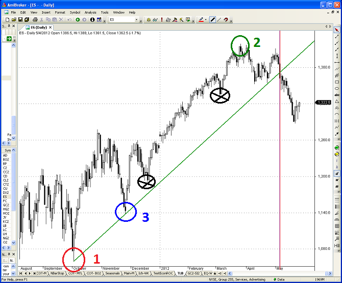
Figure 1 below is a daily chart of the E-mini S&P 500 (ES) continuous futures contract from October 2011 through May 24, 2012. We will use the above process to draw the specific bullish trendline that corresponds to the rally that began last October.
Step 1: Choose the major low that marked the beginning of the bullish trend for your desired time horizon. Once we have identified the desired time-horizon, this point is usually obvious, although there may be some judgment involved. In this case, a new low was formed on October 4, 2011 after several months of consolidation. This point clearly signified the major low at the beginning of the rally (Point #1 in red circle below).
Step 2: Moving to the right, identify the highest high that occurred after Point #1. This rule is completely objective. If there are multiple dates with the same highest high value, use the latest date (the farthest to the right side of the chart). In the example below, the highest high occurred on March 27, 2012 (Point #2 in green circle below).
Step 3: Identify the low between Points #1 and #2 that generates the shallowest slope from Point #1. This is difficult to explain, but easy to see in the chart. Our trendline will be drawn from Point #1 to Point #3. When choosing Point #3, we can only consider interim low values between Points #1 and #3. The correct choice is circled in blue below. I identified two other possible candidates (black circles with a black X) below, but you can easily see that the resulting trend lines would have had steeper slopes than the correct line through Point #3. This rule is also completely objective. Once you choose the beginning point for your desired time horizon, the rules above will always generate the same unique trendline.
Trendline Breaks
Before we can interpret the above chart, we need to define what constitutes a trendline break. There are a number of different definitions. For an intermediate-term bullish support line on a daily chart, I would suggest two consecutive daily closes below the trendline. For an intermediate or long-term bullish trendline on a weekly chart, I would use the first weekly close below the trendline. I only use closing values to identify trendline breaks; I do not use intra-day highs or lows.
If you use multiple consecutive closes to define a trendline break, that could result in larger price declines before you exit your bullish trades. However, if you use a single daily close to define a trendline break, this could generate false breaks, resulting in premature exits and forgone profits. There is a tradeoff. The important point is to choose your definition of a trendline break before you enter the trade and stick with it. The whole purpose of using objective rules is to eliminate the adverse effects of emotion on the investment process.
Using the two consecutive daily closes rule that I suggested above, we can finally determine the status of the bullish trend in the ES contract. The ES futures contract closed at a price of $1365.7 on May 7, 2012, which was the second consecutive daily close below the bullish support line. This signified the end of the rally that began in October 2011.
If I were using strategy with an intermediate-term investment horizon, would I have exited a long position in the S&P 500 after the trendline break in early May 2012? Absolutely. When would I re-establish the long position? When the ES contract breaks the new bearish trendline. Note, I did not draw the new bearish trendline on the chart, but you could use the rules above and draw the trendline yourself. The highest high on March 27, 2012 would be the logical choice for Point #1 on the new bearish trendline. Points #2 and #3 follow directly from the rules.
Multiple Trendlines
As I mentioned earlier, there can be multiple trendlines on a chart, each corresponding to a different time horizon. I used the daily ES chart above to identify the intermediate-term trend. What does the long-term trend in the E-mini S&P 500 contract look like? Is it still intact?
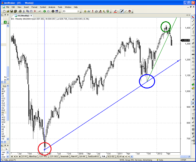
Figure 2 below is a weekly chart of the E-mini S&P 500 (ES) continuous futures contract from mid-2008 through May 24, 2012. Points #1, #2, and #3 are noted by the red, green, and blue circles below. The obvious choice for the beginning of the long-term cyclical trend was the weekly low in early March 2009. The resulting long-term bullish trendline is depicted in blue below.
As you can see from the chart, the long-term bullish trend in the S&P 500 (ES futures contract) is still intact. The long-term trendline has not been violated (at least not yet).
How would you reconcile the intermediate-term bearish trend and the long-term bullish trend in the S&P 500? It depends on your investment horizon and your tolerance for risk. If you are a long-term investor with a multi-year investment horizon and are willing to suffer through large drawdowns in your account, you could choose to ignore intermediate-term trendline breaks and only use long-term breaks to exit your bullish positions.
However, even long-term investors could reduce their risk by trimming their long positions after intermediate-term trendline breaks. There are many ways to use trendlines in your investment process. The real risk is ignoring all trendline breaks and riding the market all the way into the abyss.
What about Gold?
After equities, gold is one of the most talked about markets. Most investors and traders know that gold prices have increased dramatically since bottoming in 2001. However, gold prices have stumbled lately. What does the long-term trendline tell us about the prospects for gold? Is gold still in a bull market?
Figure 3 below is a weekly chart of the gold (GC) continuous futures contract from mid-2008 through May 24, 2012. Points #1, #2, and #3 are noted by the red, green, and blue circles below. The best choice for the beginning of the long-term cyclical trend was the weekly low in late October 2008.
At the time, gold futures prices had declined 34% from their peak in early-2008. As you will recall, the failure of Lehman Brothers and the severity of the financial crisis led to fears of deflation. In times of stress, gold often acts as a safe haven, but not when deflation is the overriding concern. The resulting long-term bullish trendline is depicted in green below.
The above chart covers several years and the exact timing of the break is difficult to see, but it is obvious that the long-term bullish trendline in gold has been violated. This is very troubling, especially in light of recent global events.
China's economy is slowing significantly and their data suggests their manufacturing sector is actually contracting. Most of Europe is already in a recession and the rest of Europe may follow shortly. The ongoing sovereign debt and banking crises in Europe continues to worsen and has the potential to create a domino effect that would make the Lehman bankruptcy seem like a picnic.
With depositors withdrawing funds out of the banking systems in Greece, Spain, and other at-risk countries, why is the price of gold going down instead of up? It is not acting like a safe haven, as it has in the past. In fact, the price behavior of gold (and other commodities) is eerily similar to 2008.
On average, commodity futures prices have declined by 27% from their respective peaks in the last year. While gold has performed better than the average commodity, its price is still down over 19% (as of May 24, 2012) from its peak in September 2011. With central banks throughout the world continuing to print money at an unprecedented pace, why have commodity prices declined by almost 30% from their highs? Deflation again seems to be a major concern for investors, just as it was during 2008. The implications are potentially ominous.
I am confident that politicians and central bankers will continue their love affair with easy money, which is bullish for commodities and for gold - eventually. Does that mean that I would buy gold now? Of course not. It just broke a multi-year bullish support line. The risks of trading against the trend are too high.
When would I consider buying gold again? You guessed it - when it breaks the bearish trendline and begins a new bullish trend. Ideally, I would like to see similar bullish patterns develop in other commodities as well. If we are heading for a repeat of 2008, then the current bearish trend in commodities and gold would probably continue throughout the recession. In that scenario, commodities could be priced for a spectacular run in the following expansion - just as they were in early 2009.
Figure 4 below is a weekly chart of the gold (GC) continuous futures contract from early-2011 through May 24, 2012. Points #1, #2, and #3 for the new bearish trendline are noted by the green, red, and blue circles below. The logical choice for the beginning of the new bearish resistance line is the weekly high in late-September 2011. The original long-term bullish trendline is depicted on the chart in green. You can now see when the bullish trendline was violated - the first weekly close below the trendline.
If we are not headed for a recession and Europe comes up with a permanent solution to their problems, then gold prices may turn up again in the near future. However, it would still be prudent to wait for a confirmation of a new bullish trend before establishing long positions in the gold market. Based on the above chart, that would currently require a weekly close above $1730. The exact closing price required would depend on the timing of the break.
Conclusion
Trendlines are one of the oldest and most popular tools in technical analysis. Unfortunately, applying trendlines inconsistently can do more harm than good. The method described in this article will help you use trendlines reliably in your investment process. Begin by creating a specific set of rules for entering and exiting the market in response to trendline breaks. The rules should be based on your investment horizon and on your tolerance for risk.
Ideally you should also use other indicators for confirmation. Consider using point and figure charts, moving averages, market-breadth statistics, COT data, and relative strength ratios. Once you have identified your indicators and rules, follow them religiously.
Regardless of your investment horizon, there is no reason to risk portfolio losses of 57% to 83% by remaining fully invested at all times. However, you will need objective rules for entering and exiting the market. The above trendline method is easy to understand and straightforward to implement. Using this approach is a good first step for investors who would like to protect their portfolios from catastrophic losses
Trader Edge Strategy E-Subscription Now Available: 20% ROR
The Trader Edge Asset Allocation Rotational (AAR) Strategy is a conservative, long-only, asset allocation strategy that rotates monthly among five large asset classes. The AAR strategy has generated 20%+ annual returns over the combined back and forward test period (1/1/1990 to 7/29/2013). Please use the above link to learn more about the AAR strategy.
Feedback
Your comments, feedback, and questions are always welcome and appreciated. Please use the comment section at the bottom of this page or send me an email.
Do you have any questions about the material? What topics would you like to see in the future?
Referrals
If you found the information on www.TraderEdge.Net helpful, please pass along the link to your friends and colleagues or share the link with your social network.
The "Share / Save" button below contains links to all major social networks. If you do not see your social network listed, use the down-arrow to access the entire list of social networking sites.
Thank you for your support.
Brian Johnson
Copyright 2012 - Trading Insights, LLC - All Rights Reserved.
.


Pingback: Do Not Short a Bull Market | Trader Edge
Pingback: Take the First Step Toward an Investment Process | Trader Edge
Pingback: How to Generate Automated Trendlines | Trader Edge
Pingback: Automated Trendlines for Indicators | Trader Edge
Pingback: Market Overbought - But Wait for the Trend Change | Trader Edge