We all have a few favorite technical indicators. However, almost all technical indicators calculate indicator values for a specific look-back period and then plot those values over time. With this approach, we can only analyze one look-back period at a time.
Of course, we could create several graphs for each indicator, each with a different look-back period. However, if we use several indicators, each with multiple periods, we would quickly be overwhelmed with data. I recently read about an innovative solution to this problem in a March 2012 Technical Analysis of Stocks & Commodities article titled "Introducing SwamiCharts," written by John Ehlers and Ric Way.
Swami Charts - CCI
Swami charts use a color heat-map to depict all indicator values over a range of look-back periods on a single chart. While some of the detail for a single look-back period is lost in the heat-map, Swami charts allow us to see indicator values for an entire range of look-back periods - giving us the big picture in a single chart.
Let's look at a Swami chart, but first we need a representative technical indicator. We will use the commodity channel index (CCI), one of the most common technical indicators. Without going into the specific formula, the CCI is an oscillator that calculates a volatility adjusted deviation of the current price relative to an N-period moving average. The CCI is centered at zero and is unbounded; there is no maximum or minimum value.
There are two different ways to interpret the CCI. When used as a trend indicator, positive CCI values imply increasing prices and negative CCI values signify decreasing prices.
The CCI can also be used as a leading indicator to identify overbought or oversold conditions. When the CCI is above 100 and decreasing, the market may be overbought, suggesting a possible reversal in the recent bullish price behavior. When the CCI is below -100 and increasing, the market may be oversold, implying the potential end or reversal of the recent downtrend. Remember, the CCI is unbounded; very high or very low (negative) CCI readings imply even more extreme price behavior.
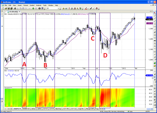
Figure 1 below is a weekly chart of the e-mini S&P 500 futures contract from late 2009 through the first week of April, 2012. The top panel contains a weekly candlestick chart and two moving averages. The middle panel is a line graph of a standard 13-week CCI. The bottom panel contains the Swami chart for the CCI. The vertical axis of the bottom panel is the look-back period for CCI, beginning with 3-weeks at the bottom, increasing to 52-weeks at the top of the panel. Bullish values are green, while bearish values are red. CCI values near zero are neutral and are depicted in yellow.
The pull-back in early 2010 was relatively minor (Area A in Figure 1 above). As prices began to decline, CCI values with low look-back periods at the bottom of the panel were the first to turn red (negative). As the pull-back deepened, the red color bled up the chart, as the CCI values turned negative for higher look-back periods as well. Notice that the CCI values for the longest look-back periods never turned negative (red), which was consistent with a minor price reversal.
The speed of the pull-back can be gauged by the slope of the color change versus the passage of time. The intensity and breadth of the colors convey the severity of the pull-back. For example, look how steep the transition was from green to red in August of 2011 (Area D above). In addition, note how the red color (negative values) spread rapidly to all look-back periods. Compare this to the modest price reversals in early 2010 (Area A above) and mid-2011 (Area C above). Note the significant differences in the speed and degree of the color changes.
As I mentioned earlier, extreme CCI values can expose overbought or oversold conditions. The August-September 2011 period (Area D above) certainly looks like an extreme oversold environment on the Swami chart, but we need additional tools to help us distinguish between a prospective bullish price reversal and the beginning of a new downtrend.
SwamiChart - COT
If one Swami chart is good, then two would be even better. However, instead of using a price oscillator, this time I would like to create a Swami chart using my custom commitment of traders (COT) indicator. COT data can be invaluable in forecasting prospective market turning points. If you would like a refresher on analyzing COT data, please revisit my previous article "Trade With the Experts."
In brief, legacy COT data aggregates futures positions for commercial traders, large speculators, and small speculators. When using COT data, our objective is to trade with the commercial traders and against the speculators, but only at historically extreme position levels. In addition, commercial traders are typically early, so we need to wait for confirmation of the reversal in the price trend before entering a new directional trade.
To make it easier to evaluate the COT data across all futures contracts, I created a standardized indicator that combines the relative positions of commercials and speculators into a single value. However, as was the case above with the CCI, my custom COT indicator uses a single look-back period.
Figure 2 below is a weekly chart of the e-mini S&P 500 futures contract from late 2009 through the first week of April, 2012. The top three panels contain the same information as Figure 1. The fourth panel is the Swami Chart for the custom COT indicator. Again, green indicates bullish and red indicates bearish. The bottom panel contains the custom COT indicator for a specific look-back period. Horizontal green and red lines are used to designate extreme bullish and bearish position data in the bottom panel.
The pull-back in August and September 2011 (Area B below) was very severe. Note the rapid change from green to red in the CCI Swami chart. In addition, CCI was negative (red) over the entire range of look-back periods. Was this the beginning of a new downtrend?
Not according to the commercials. Not only was the COT indicator in the bottom panel extremely bullish, the COT indicator was bright green for all look-back periods in the COT Swami chart. This would have made an excellent buying opportunity, which we could not have confirmed without the COT indicator.
So, where do we stand today? The CCI Swami chart is bright green for all look-back periods, while the COT Swami chart is bright red over a wide range of look-back periods. This suggests a reversal or at least a pause in the bullish price trend in the S&P 500. It is difficult to see in the chart, but the closing price last week was slightly below the short-term moving average, potentially confirming the bearish COT signal. Equity prices have continued to decline this week, adding more support for a potential trend reversal.
COT Extreme Markets - Revisited
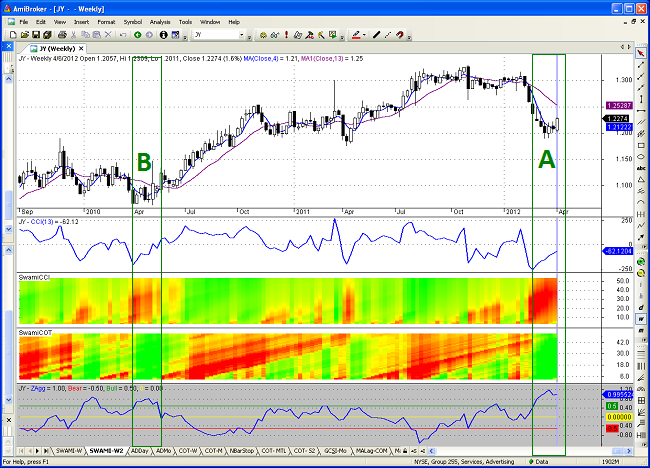
In my March 28, 2012 COT article, I identified the futures markets with the most extreme bullish and bearish COT indicator values. At that time, the contract with the most extreme bullish COT indicator value was the Japanese Yen. Figure 3 below is a weekly chart of the Japanese Yen and has the same format as Figure 2 above: candlestick chart, CCI indicator, CCI Swami Chart, COT Swami Chart, and COT indicator from top to bottom.
In late March and early April (Area A below), the CCI Swami chart suggested a very oversold environment, with negative CCI values across all look-back periods. However, commercials were extremely bullish, suggesting a potential bullish reversal. Over the past few weeks, prices began to climb, crossing the short-term moving average and confirming the COT buy signal. Yen prices have continued to advance this week.
The Japanese Yen chart had a similar bullish pattern in April of 2010 (Area B below). CCI was negative (red) over many look-back periods; however, the current environment is even more extreme (the red color is much more pervasive in the CCI Swami Chart). In both periods, the COT values were bullish (green) across all periods. In addition, the COT indicator value for the single look-back period in the bottom panel is currently higher (more bullish) than in 2010. Notice how the bullish signal in 2010 led to a long-term rally in the Yen.
When I wrote the original COT article about two weeks ago, the futures contract with the most extreme bearish COT position data was Soybeans. Figure 4 below is a weekly Soybean chart and has the same format as Figure 2 and 3 above: candlestick chart, CCI indicator, CCI Swami Chart, COT Swami Chart, and COT indicator from top to bottom.
Soybeans have enjoyed a remarkable price move to the upside. This price movement is also reflected in the positive (green) CCI values in the Swami Chart over a wide range of look-back periods. As we would expect, commercials are becoming increasingly bearish, indicated by the red values creeping up the COT Swami chart. As I have mentioned repeatedly, commercials are typically early and can be on the wrong side of a price trend for weeks or even months.
An excellent example of this was the second half of 2010. Commercials were bearish for six months and Soybean prices continued to rise. The CCI Swami chart was bright green and the COT Swami chart was solid red - for almost six straight months. That is why we always wait for prices to reverse before trading against the prevailing trend - and we always use stops.
Putting Swami Charts to Work
Swami charts allow us to visualize indicator values for a wide range of look-back periods in a single chart. However, some detail is lost when using heat-maps. As a result, I prefer to use Swami charts in conjunction with indicator line graphs based on a single look-back period. This provides a very complete picture of each technical indicator.
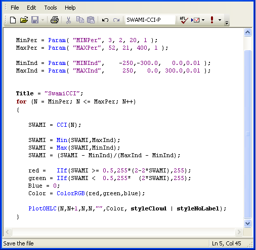
In the Technical Analysis of Stocks & Commodities article, the use of Swami charts was limited to bounded oscillators. However, with some minor code changes, it is possible to create Swami charts using unbounded indicators (such as CCI) as well.
Below (in Figure 5) is the code that I used to create and graph the CCI SWAMI indicator. I modified the original AmiBroker code from the Traders' Tips section of Technical Analysis of Stocks & Commodities. The code below handles unbounded indicators by capping extreme values. In addition, it allows the user to specify the range of custom look-back periods for the SWAMI chart.
I have not devoted much time in previous posts to the discussion of research platforms, but they are instrumental to my success as a trader. AmiBroker is my primary research and development platform. I use it to develop and test all of my systematic trading strategies. In addition, I also use it to replicate and test interesting new tools that I read about in various technical publications and blogs.
AmiBroker is a very powerful platform and is quite inexpensive; it only costs a few hundred dollars. In addition, it is lightning fast. However, in order to use the platform, you will need to have some elementary programming skills. The better your skills, the more you will get out of the platform.
I subscribe to Technical Analysis of Stocks & Commodities magazine and Active Trader magazine. Reading trade journals and trading blogs is an excellent way to discover new tools and techniques that could improve your investment process. However, it is important to also have a research platform to experiment with your new prospective tools. This will give you the ability to develop an investment process that is tailored to meet your specific investment objectives and risk tolerance.
Please note that we are NOT affiliated with AmiBroker, Technical Analysis of Stocks & Commodities magazine, or Active Trader magazine (although I have written an article for Active Trader magazine) and we are not compensated for referrals.
I hope you found the above article on Swami charts to be interesting. I would encourage you to experiment with Swami charts using other technical indicators as well. Take some time to review past chart patterns and observe how each looked on the heat-map. It will take some time to become proficient with this new tool, but it looks like an interesting addition to our arsenal
Feedback
Your comments, feedback, and questions are always welcome and appreciated. Please use the comment section at the bottom of this page or send me an email.
Do you have any questions about the material? What topics would you like to see in the future?
Referrals
If you found the information on www.TraderEdge.Net helpful, please pass along the link to your friends and colleagues or share the link with your social network.
The "Share / Save" button below contains links to all major social networks. If you do not see your social network listed, use the down-arrow to access the entire list of social networking sites.
Thank you for your support.
Brian Johnson
Copyright 2012 - Trading Insights, LLC - All Rights Reserved.
.












Pingback: A More Efficient Relative Strength Indicator | Trader Edge
Pingback: Use Sector Confirmation to Improve Your Trading Results | Trader Edge
Pingback: Are the Seasonal Trends Working this Year? | Trader Edge