Two months ago in an article titled "Use Relative Strength to Identify Market Trends," I explained how to use the relative strength of two different indices, futures contracts, or ETFs to identify market trends. This is one of my favorite market forecasting techniques; unfortunately, it only works for symbol pairs.
As a result, I was pleased to read a recent article about a similar relative strength approach that could be applied to any number of symbols. The title of the article was "Applying The Sector Rotation Model" and it was written by Giorgos E. Siligardos. The article appeared in the August 2012 issue of Technical Analysis of Stocks and Commodities (TASC).
The remainder of this article will explore a variation of this approach and explain how to create a custom relative strength indicator to identify market trends. The resulting relative strength indicator will be used to examine the current market environment and the Great Recession of 2008. AMIBroker code will also be provided.
"Applying the Sector Rotation Model"
In the TASC article, Siligardos explained that certain sectors tend to consistently outperform during bull markets and other sectors tend to outperform during bear markets. He constructed an indicator by subtracting the average rate-of-change (ROC) of the bearish sectors from the average ROC of the bullish sectors. He chose a 75-day period for the ROC calculations. When the indicator value was positive, the bullish sectors were outperforming the bearish sectors and vice versa.
In his examples, he used Financials (XLF) and Discretionary (XLY) for his bullish sectors and Energy (XLE), Staples (XLP), and Utilities (XLU) for his bearish sectors. However, Silgardos' market-cycle graph indicated that Financials (XLF), Discretionary (XLY), and Industrials (XLI) outperform in the early stages of a bull market and Staples (XLP), Health Care (XLV), and Utilities (XLU) outperform throughout bear markets. As a result, I used these six sector ETFs in the graphical examples below.
An Alternative RS Timing Indicator (for Multiple Symbols)
In addition to using a different list of sector ETFs, I modified the indicator as well. As I mentioned above, Siligardos used a ROC calculation for a 75-day period when constructing his indicator. Unfortunately, the indicator drops off all information outside the 75-day period. I prefer to retain that data. As a result, I created a cumulative RS timing indicator that uses all past relative return data, but still works with multiple symbols. The actual AMIBroker code is provided at the end of the article, but here are the steps required to create the indicator.
- Calculate the average arithmetic return for all bullish sectors for each period
- Calculate the average arithmetic return for all bearish sectors for each period
- Subtract the average bearish return from the average bearish return for each period
- Add 1.0 to the return difference for each period
- Calculate the natural logarithm of the results from Step #4
- Multiply the results from Step #5 by 100
- Calculate the running cumulative total over all periods since inception
- Calculate a moving average of the cumulative total to identify changes in trend direction
The indicator values in Step #7 represent the cumulative return differences between the bullish and bearish sectors. Natural logs are used to allow the periodic returns to be added together over time. Note: you can use any number of symbols for the bullish and bearish sectors and this approach works for any periodic time frame (5-minute, 15 minute, hourly, daily, weekly, monthly, etc.).
Current Market Environment
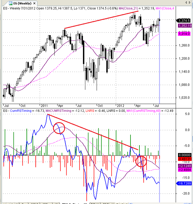
The top panel in Figure 1 below is a weekly candlestick chart of the continuous futures contract for the E-mini S&P 500 Index. The blue line in the bottom panel is the cumulative RS market timing indicator (RSMTI), which was calculated using the steps outlined above. The darker solid line in the bottom panel is a 25-period moving average of the RSMTI and the lighter dashed line is a 40-period moving average of the RSMTI. Finally, the red and green histogram depicts the natural log of the weekly return differences (bullish - bearish).
More caution is advisable when the blue RSMTI falls below the shorter-term (21-week) moving average. This indicates the market participants are becoming more conservative and moving money from riskier to safer sectors. When the RSMTI falls below the longer-term (40-week) moving average as well, this indicates a more significant correction.
Remember, unlike hedge fund investors, many institutional equity managers are prohibited from market timing. In other words, they must remain fully invested in equities - except for a marginal amount of cash to facilitate transactions. As a result, when they become more risk averse, their only option is to shift assets to sectors that tend to outperform in bear markets - the same sectors that we are using in the RSMTI. In this environment, the market indices may continue to rise, but the RSMTI will fall, offering an early warning signal of a trend reversal.
That is exactly what happened in early April of 2011 (see circle in Figure 1 below), before an 18% correction in the S&P 500 index. A second bearish crossover occurred in April of 2012. After a modest decline, equity prices have resumed their upward trend, but the RSMTI has continued to fall. This is a very ominous sign for the market, which is even more obvious in the daily chart.
Before moving on to the daily chart, notice that the S&P 500 is making higher highs for the past year, but the RSMTI is making lower highs for the same period (see red lines in Figure 1 below). This is a classic divergence, which also has bearish implications for the equity markets. Equity prices are rising, but investors are becoming more risk averse. Historically, this has been a reliable leading indicator for bear market cycles.
Divergence in Daily RS Timing Chart
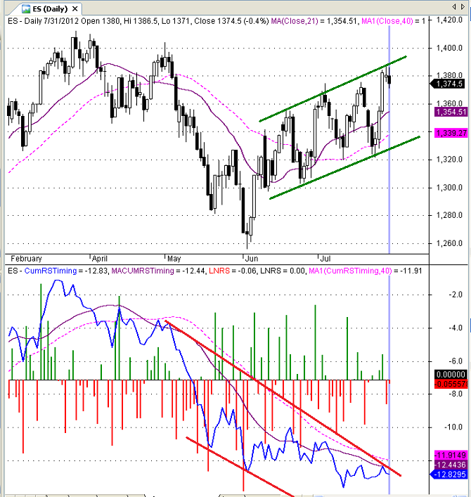
As mentioned earlier, this indicator can be used in any time frame. To identify shorter-term trend changes, you can use a daily chart or even an intra-day chart. Figure 2 below is a daily candlestick chart of the continuous futures contract for the E-mini S&P 500 Index with a daily chart of the RSMTI. When the RSMTI crossed below the 25-day moving average in early April of 2012, it signaled a short-term trend reversal. As expected, the S&P 500 index declined from early April to early June 2012.
Then something strange happened. The S&P 500 has been rising steadily since early June, making a succession of higher highs and higher lows (see green channel in Figure 2 below). This is normally a very bullish sign. However, during that same period, the RSMTI has been making a series of lower highs and lower lows - a very bearish sign (see red channel in Figure 2 below). This divergence suggests a potential trend reversal in the S&P 500 index.
Long-Term Perspective
To understand the big picture, it can be helpful to look at monthly charts. This eliminates a lot of the noise in daily and weekly charts. Figure 3 below is a monthly candlestick chart of the continuous futures contract for the E-mini S&P 500 Index with a monthly chart of the RSMTI. The format is the same as the charts above, except a more appropriate 7-month moving average period was used in both panels.
Notice that the monthly RSMTI provided an early warning signal in 2007 - very near the market peak. It also provided a timely signal to reenter the market in 2009. Since the end of the Great Recession, it has identified three significant market pullbacks and is currently bearish, even as the market continues to move higher.
AMIBroker Code
As promised, Figure 4 below is a screen shot of the actual AMIBroker code that I used to create the above charts. The code was designed to use three bullish and three bearish sectors. However, you could modify the code to add more bullish or bearish symbols. The bullish and bearish symbols can be modified interactively.
Conclusion
Individual technical indicators should never be used in isolation, but the RSMTI provides historically reliable early warning signals of market trend reversals - in any time frame. The current trend of the RSMTI is definitely bearish and the negative divergences are even more troubling. My overall market view is currently bearish for equities and the RSMTI adds new evidence to support that position
Trader Edge Strategy E-Subscription Now Available: 20% ROR
The Trader Edge Asset Allocation Rotational (AAR) Strategy is a conservative, long-only, asset allocation strategy that rotates monthly among five large asset classes. The AAR strategy has generated 20%+ annual returns over the combined back and forward test period (1/1/1990 to 7/29/2013). Please use the above link to learn more about the AAR strategy.
Feedback
Your comments, feedback, and questions are always welcome and appreciated. Please use the comment section at the bottom of this page or send me an email.
Do you have any questions about the material? What topics would you like to see in the future?
Referrals
If you found the information on www.TraderEdge.Net helpful, please pass along the link to your friends and colleagues or share the link with your social network.
The "Share / Save" button below contains links to all major social networks. If you do not see your social network listed, use the down-arrow to access the entire list of social networking sites.
Thank you for your support.
Brian Johnson
Copyright 2012 - Trading Insights, LLC - All Rights Reserved.
.









Another superb post.
Pete,
Thanks again for your feedback. I am glad that you enjoyed the post.
When I programmed the indicator, I was quite surprised by the magnitude of the recent divergence between equity prices and the RSMTI. Since completing the post, I have continued to experiment with the indicator, testing a variety of bullish and bearish symbols. The results are consistent across a wide range of symbol combinations. They all demonstrate an increasing level of risk aversion, which is inconsistent with the upward trend in equity prices.
Perhaps today was the first step toward a more meaningful correction.
Thanks again for your interest in TraderEdge.Net.
Regards,
Brian Johnson
Pingback: Use Relative Strength to Confirm Trend Direction | Trader Edge
Pingback: Top 10 Trader Edge Articles | Trader Edge
Pingback: Relatlive Strength Warning Sign | Trader Edge
Pingback: Relative Strength Indicator Predicted Current Pullback | Trader Edge